Thanks to a generous grant from the LGBTQ2 Community Capacity Fund that has allowed us to engage in a year-long capacity-building project, SPECTRUM has been able to complete a re-brand that speaks to some of the changes we’ve made to the organization this year and the direction we are working towards.
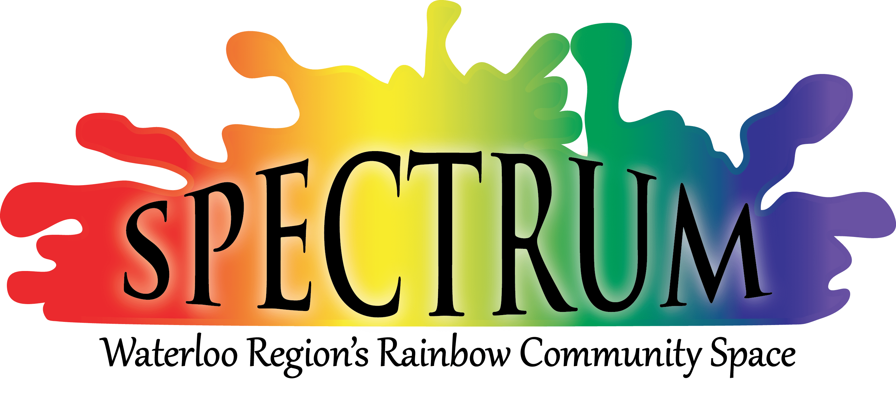
Meet our new logo!
Our Project Excelsior team worked with The Public studio, a community-centered, social justice design studio, to develop a new logo and brand standards. The new logo speaks to the way SPECTRUM provides 2SLGBTQ+ communities with a space for refuge, which in turn, leads to both personal and political growth, to challenging conversations, and, with time, a more joyful world.
In the new logo, we see the idea of “space” and “refuge” represented by a rainbow form. As letterforms move toward this space, we see them coming to life. We are introduced to a sense of playfulness, optimism, joy, and resiliency. This concept also allows space to explore the dichotomies in this work, namely, the joyful, playful, unapologetic ways of being within the space, alongside the professionalism needed to speak truth to power and advocate on behalf of our communities in the more public sphere.
The goal was to prioritize the concepts of potentiality, transformation, protection, and growth. We explore the rainbow as a visual cue for both safety and refuge (internal) and celebration and joy (outward).
The colours we chose and the number of “bars” in the rainbow are intentional. In moving away from the “standard” six colours of the Pride flag, we leave room for places of growth, alternative understandings of who’s included here, and attention to the roots of queer liberation and where these movements come from. In the colour palette, we have colours that still run adjacent to the six-colour flag, as well as warm browns and pinks that aren’t necessarily desaturated versions of the other colours, but are colours in their own right.
We are very grateful to have had the opportunity to work with The Public on this re-brand. Their team spent a lot of time getting to know SPECTRUM and its people, the ways we work, our history, and our future goals. We believe the new logo does an excellent job of identifying SPECTRUM as an organization.
As we move forward, we’d also like to reflect on our history and thank Eric Chengyang, Thane Robyn, and the late Thom Ryan who created the previous versions of our logo. Eric Chengyang designed our first logo back in February 2013. In September 2015, the logo was cleaned up by Thane Robyn, who separated the textual sub-title of our name (part of our full legal name) from the graphic itself. In June 2016, Thom Ryan modified the image still further by changing the cursive subtitle to a san-serif all-caps version for readability.
 |  |
We’ve also launched a new website!
We are also excited to be launching our new website designed by our Marketing & Development Coordinator, Ash Kreider. The new site was designed with care taken to respond to feedback that SPECTRUM has received over the last year or so, including thoughts shared by the community in various surveys and focus groups we conducted earlier this year. The new site is accessible, easy to navigate, faster to load, and is designed to reflect the new brand standards created by The Public.
We already have a list of additional changes in the works. These will be implemented throughout the rest of the year. We hope you’ll enjoy using the new site and celebrating our new brand identity with us.